36 Days of Type Broadside Project
A Seaport Museum Blog
by Christine Picone, Designer at Bowne & Co., May 27, 2021
If there’s one thing everyone learns when they visit Bowne & Co., it’s this: we love type!
We wrapped up our Isolation Type project earlier this year, just in time to take on another endeavor involving type specimens. We’ve wanted to print a well-considered alphabet specimen for ages now, and the annual international typographic celebration 36 Days of Type came around just in time!

Created by the Spanish design studio Treintayseis, 36 Days of Type is a yearly open call to designers, illustrators, and artists to share their interpretations of each of the letters and numbers of the Latin alphabet. Contributors are asked to design a letter or number each day for 36 consecutive days and post them on social media, “in a global simultaneous act showing the outcome of the ability to represent the same symbols from thousands of different perspectives.”
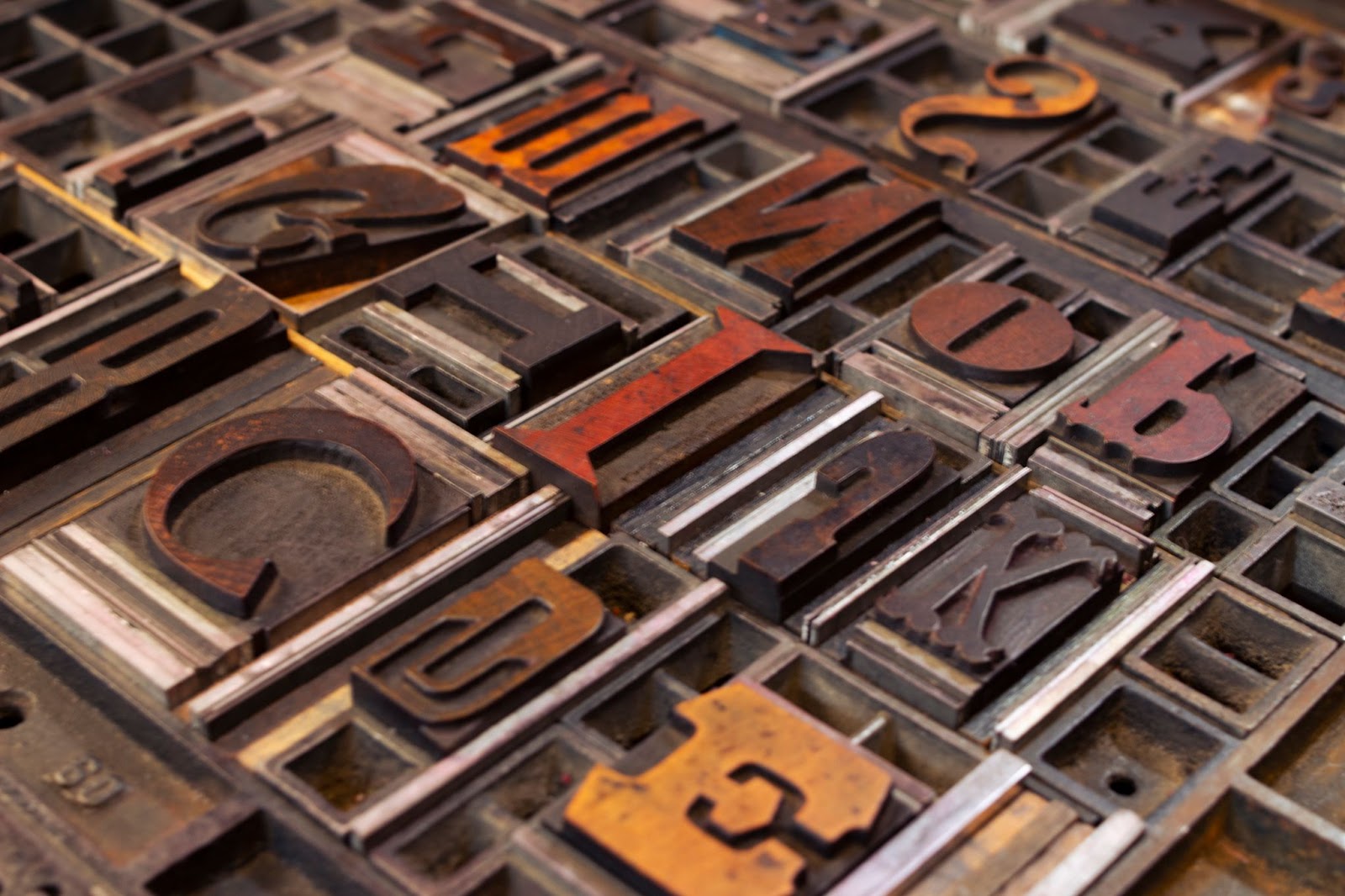
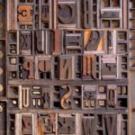
As printers and designers, we look forward to the 36 Days event each year, and we knew we couldn’t let another year go by without getting involved ourselves. The Bowne & Co. contribution is a twist on the original call for new letterforms: instead, we presented our favorite characters from our working collection of (mostly) 19th-century wood type.
Almost as soon as we began to hunt through our collection of about 180 wood typefaces for the most interesting and eccentric characters, we decided we had to print a broadside poster to commemorate the project. So we set about in our usual, multi-step process: get inspiration from the collection, digitize the collection, design on the computer, and then head for the printing press. It’s the workflow we use for almost every project at Bowne & Co., large or small, from individual notecards to posters to custom wedding invitations.
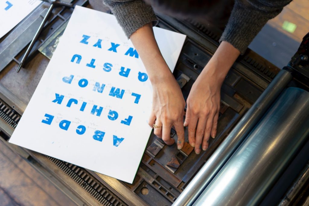
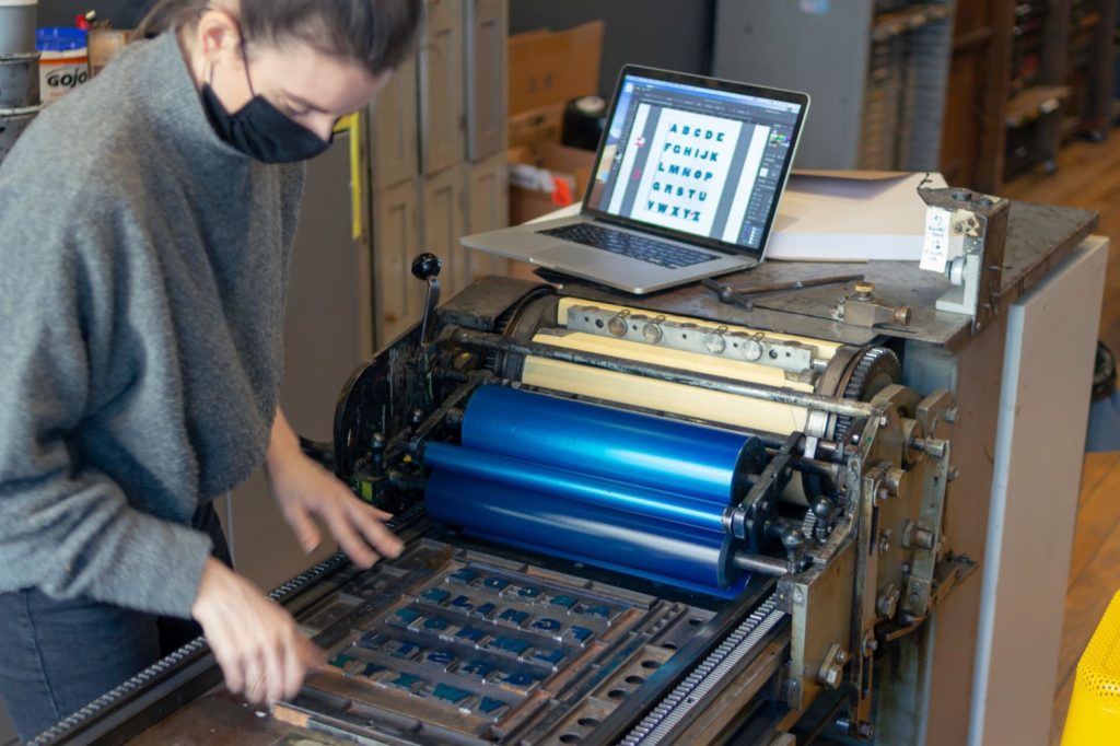
While we usually conduct this work with our museum visitors looking on, we decided to document each step with photos in order to illustrate up-close all of the efforts that are made in letterpress printing. From initial concept to finished print, it’s a mostly physical process, with each change and adjustment made by hand. We also hope the photos convey the joy that goes along with letterpress printing, and the pleasure it is to move about, jumping from type cabinet to printing press to computer, and back to the press again (or sometimes both at the same time!).
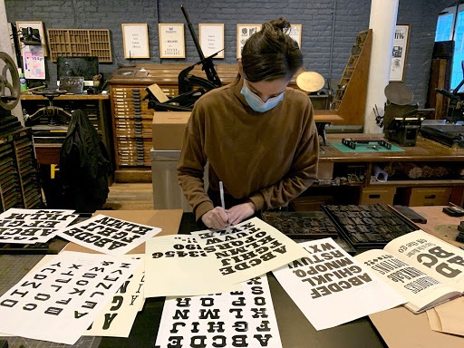
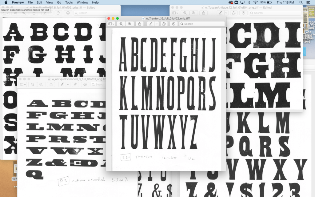
First, we looked through our own shop specimen book to get an idea of what faces we might like to showcase. Then, using our proofing press, we printed working specimens of the full character sets of each typeface. We scanned them, cleaned them up in Photoshop, and added them to our growing library of digitized typefaces that we use to design projects on the computer.
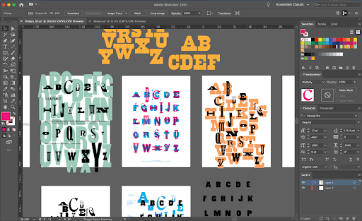
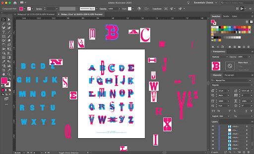
With the type digitized, we worked on several potential designs in Illustrator. Not every letterpress printer these days uses a computer, but many do. We love using the computer because it allows us to make iterations quickly, with the ability to make substitutions and test out color combinations with just a few clicks. Nothing is worse than investing hours in typesetting and printing, only to have to start all over again because it doesn’t look like what you expected!
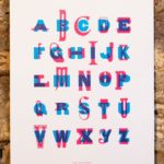
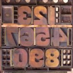
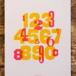
Eventually we settled on a design that would have been very difficult to accomplish without the ability to test it on the computer. In order to show off the beauty and variety of our 19th-century letterforms, we decided to contrast them. We made two two-color broadsides: one for the alphabet and one for numerals. On each broadside, we overprinted a single character set of gothic type with an array of display types.
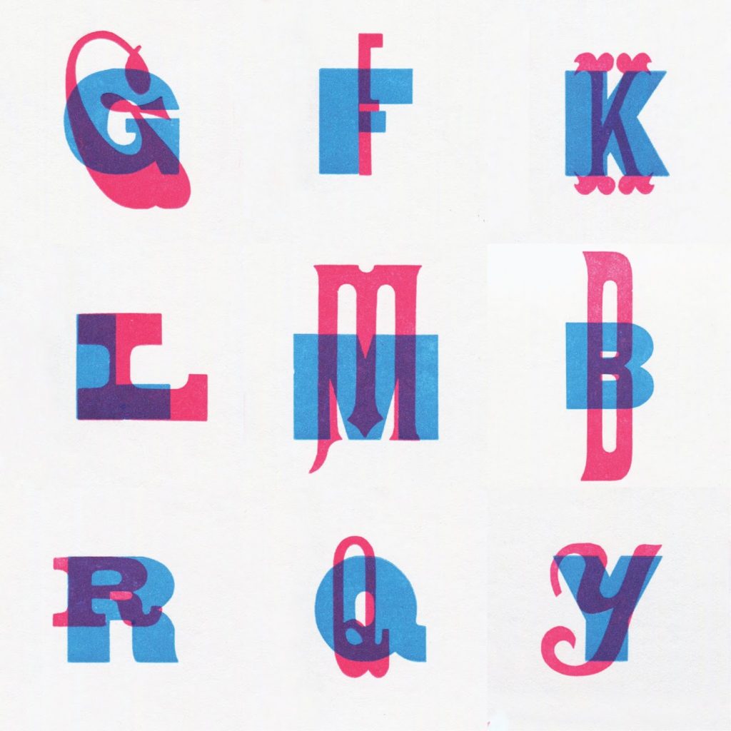
We sought combinations that would bring out the contrast between the gothic and display letterforms, whether in scale, proportion, line weight, or ornament. The characters in some pairings appear to snuggle up to one another, while in others the features of the display type are brought out by a consistent element, such as sharing a baseline. Some of our favorites were the pairings that created an interesting new shape in the overprinted areas.
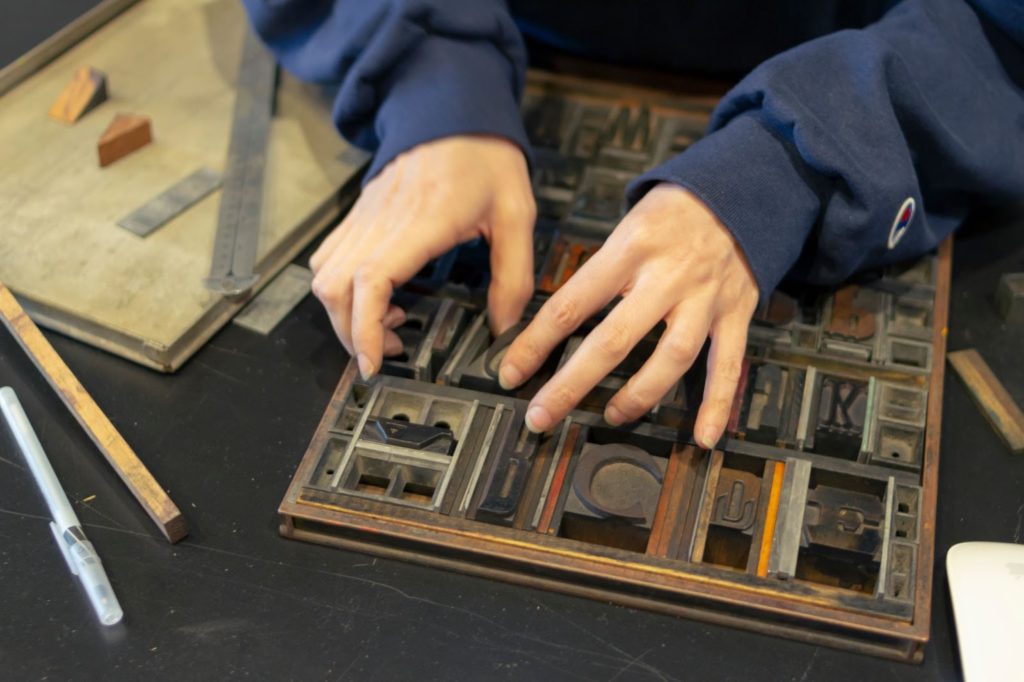
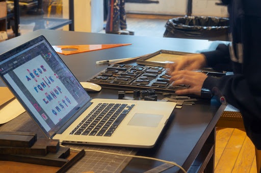
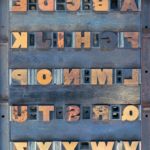
Then the labor of typesetting and printing began! Typesetting was particularly labor-intensive for this project. Two forms for each print were needed: one for each color. The gothic types were set simply in straight lines. But the display types, being of different sizes and falling in different locations over the gothics, were all over the place. Using the digital design files as a guide, we measured the distances between characters and placed furniture, reglets, leads, and tiny bits of spacing accordingly. It’s like putting a puzzle together.
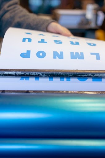
Time to print finally arrived. The gothic layer—printed in blue on the alphabet print and in yellow for the numerals—went down first. We adjusted registration on press, consulting the computer to check our measurements! Then the display types were laid down on top in magenta.
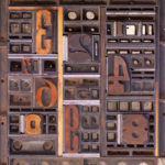
Our broadsides printed, we couldn’t wait for the April start date to share our letterforms and to chat about them with our followers. As curators of letterforms, rather than designers of letterforms like most of the other 36 Days participants, we feIt it was important to share not just the finished print but also the physical historic characters themselves, typeset and ready to be printed. Being able to list our prints for sale in our brand-new online shop was a great bonus, with the proceeds—as always—going to support the museum.
Check out all 36 characters from our 36 Days of Type contribution on Instagram, or search #36daysoftype to see letterforms from all over the world. And be sure to purchase our Alphabet and Numerals broadsides in our online shop!
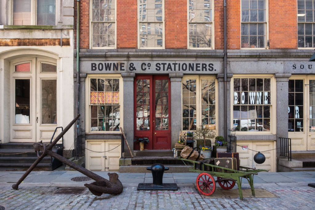
Visit Our Online Shop
We’re excited to announce our new Bowne & Co. Online Shop with a special selection of core offerings from Bowne & Co.
